

4 min read
With Canada’s 43rd Federal Election not too far in the rearview mirror, we at ThinkData Works were curious as to what we can learn about our most recent election by stepping back from the punditry and analyzing some data. After all, using government data is a great way to understand how our government works.

There are dozens of open data sources we could use to explore this subject, but we wanted to primarily use data released through Elections Canada and Statistics Canada. Overall, we used 8 datasets to help us discover insights about the election:
- Contributions to all political entities from January 2004 to present
- Summary tables of elected officials for all ridings across Canada (5 datasets, 1 for each year)
- Census Profiles 2016
- FSA boundaries
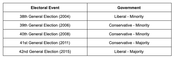
First, we conducted some high level analysis of the Contributions dataset, which provides extremely granular information on every campaign contribution made since 2004. We wanted to see which party received the most contributions nationwide and by province. Keeping in mind that Canada’s governing party since 2004 has been as follows:
Which official party receives the most contributions by individuals?
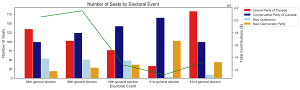
The earliest election for which we have contributions data is the 38th general election. The most recent election for which we have contributions data is the 42nd general election, which took place in 2015. Between 2004 and 2015, this is how contributions to each political party stacked up.
For all general elections except for the 38th general election, The Conservative Party has consistently received the greatest amount of contributions from the general public, but this has not historically led to them forming the governing party. Despite the Conservatives receiving 50% more contributions in the 42nd general election, Justin Trudeau’s Liberals won a majority.
Is there a relationship between where contributions are coming from, and how the province voted?
But seeing which party receives the most contributions year over year is painting the election with broad strokes. In order to start to understand the regional nature of politics, we wanted to find out where in the country the contributions are coming from, and whether there is a relationship between total contributions and how the province voted.
While there has been an overall decline in the total amount of contributions for political parties, this trend is not true for all parties. The Liberal (-$5,740,388) and Conservative (-$2,313,050) parties have suffered the greatest from declining independent contributions between 2004 and 2015. In contrast, parties such as the NDP ($67,795), Independent ($12,329), and the Green Party ($70,413) have seen a slight increase in contributions over the same timeline.
It is important to note here that a deeper analysis show no correlation between individual contributions to political parties and the number of seats each party occupies in parliament. That Canada’s two largest have been receiving fewer independent contributions over the years, while smaller parties are gaining traction is surely an interesting trend!
Who are the largest contributors and where are they based?
One of the things we do really well here at ThinkData Works is combine different open data sources to uncover insights. So we decided to combine elections data with census data to see if we can understand a bit more about where contributions are coming from.
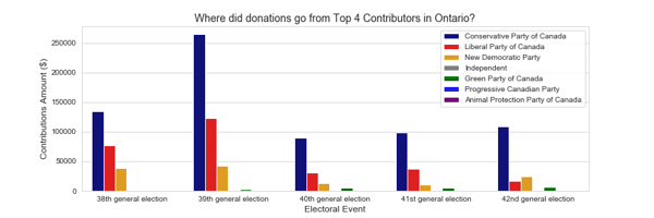
The first question we asked ourselves was which province made the most contributions overall, and are we able to traverse the different datasets to learn more about the regions that made the most contributions to political candidates.
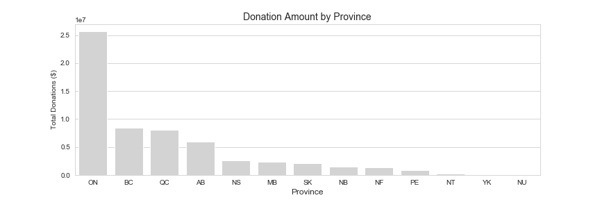
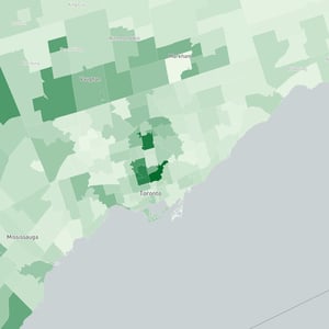
By far, Ontario has made the most contributions to electoral candidates. Given the significance of the amount of contributions, let’s see if we can learn more about the areas who made these contributions.
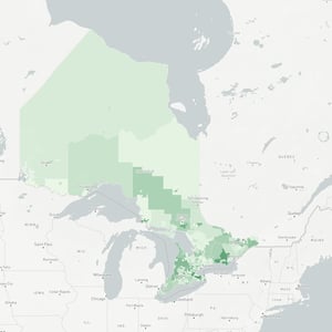
In the maps above, darker regions indicate greater contributions to political parties, while lighter regions indicate lesser contributions to political parties. The darkest regions appear in Southern Ontario. A few quick queries of our dataset reveals that four of the five postal code regions that have made the most contributions over all election periods are in Toronto (postal codes starting with M4 and M5), and one postal code region located in Prince Edward Island.
Of the top 4 regions making the most contributions to political parties in Toronto, the majority of contributions were to the Conservative Party of Canada.
Using the Contributions dataset provided by Elections Canada, postal code regions with information provided by the Canadian 2016 Census, we are able to learn that individuals who have made contributions to political parties in the past are generally slightly older than the average Canadian, have significantly higher income, and tend to have earned higher degrees.
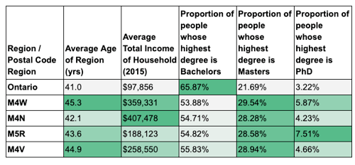
While it is perhaps common sense that people who have more expendable income are those who are more able to make contributions, census data helps us gain more granular insight into the ideological landscape of the country.
Which recipient received the most contributions?
Next, let’s shift our attention to understand which electoral candidates have commanded the most contributions.
From the Contributions dataset provided by Elections Canada, we summed up total contributions (monetary and non-monetary) and grouped the aggregates by electoral candidate. Below are the candidates who have received the most contributions between the 38th and 42nd general elections.

Once again, we see that the conservatives dominate this chart. But the candidate who has commanded the most contributions throughout these election years is Olivia Chow, NDP Member of Parliament for Trinity-Spadina from 2006-2014.
How did contributions to political parties change between the 41st and 42nd general election?
The last thing we are going to look at is change in contributions amount between the 41st and 42nd general elections. This election is interesting for a number of reasons, not least of which that Canada saw a switch from a Conservative majority government to a Liberal majority government between these elections. Given the swing, we wanted to investigate which regions saw the biggest change in contributions from the 41st election to the 42nd election. The bar chart below shows the postal code regions with the biggest increases and decreases in donation amounts to political parties.
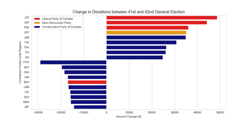
From this chart, we can see that conservatives lost a lot of support in the form of contributions between the 41st and 42nd general election, while the Liberals saw significant increases. The Liberals saw the greatest surge in contributions from regions in Ontario; specifically Milton (L9T), Brampton (L6P), and Greater Sudbury (P3E). While the Conservatives saw increases in Brampton (L6R), Lethbridge (T1K), Calgary (T3H, T3J), and Oakville (L6T).
In the form of losses, Conservatives lost support in the form of contributions from Kelowna (V1W), Brantford (N3T), Prince Edward Island (C0A), Vaughan (L4K), Barrie (L4M), Woodbridge (L4L, Edmundston (E3V), Toronto (M4N), and Val-d’Or (J9P).
Follow the Money
Campaign and political contributions are, clearly, not necessarily a benchmark for what party will lead our Country, but they are an undeniable feature of our democracy. By analyzing this rich data and blending it with socio-economic and demographic signals we get from the Canadian Census, a clearer picture of not only the political leanings, but the donation profile, of Canadians comes into focus. As with information anywhere, the trick is to find the right data and ask the right questions.
ThinkData offers a lot more data than that – over 250,000 thousand datasets from more than 75 countries around the world. Request a consultation with one of our data experts to talk about external data.

4 min read
How to better leverage data for risk management and crisis response
It’s becoming increasingly difficult to manage risk in a global climate that’s growing in complexity. On the other side of this coin, however, is an...
3 min read